

#3 - The World Priced in Gold
Measuring the world in fiat is like measuring distance with an elastic band — both the object and the ruler move. Pricing commodities, equities, and housing in gold changes the ruler and reveals a different macro picture, with August 15, 1971 as the inflection point.
by Game Of Francs Research Team
Measuring the world in a modern currency is like measuring distance with an elastic band: the object you are measuring may move, but so does the measuring instrument itself. Every reading you take conflates two entirely separate phenomena — changes in the thing, and changes in the unit. Pricing the world in gold is a way to change the ruler.
I. The Problem of the Elastic Ruler
When we say oil is expensive, food prices are soaring, or that commodities are entering a supercycle, we are almost always speaking in dollars. But the dollar, like every modern fiat currency, is not a fixed unit of measurement. It expands and contracts with credit cycles, policy decisions, geopolitical shocks, banking crises, and the shifting confidence of its holders. Measuring the world in a modern currency is like measuring distance with an elastic band: the object you are measuring may move, but so does the measuring instrument itself. Every reading you take conflates two entirely separate phenomena — changes in the thing, and changes in the unit. Pricing the world in gold is a way to change the ruler.
It does not require any ideological commitment to gold. It does not require you to predict the next move in the gold price, or to believe that a gold standard is politically feasible, or even desirable. It requires only a willingness to ask a cleaner question: how much real stuff does it take to buy other real stuff, when measured in a monetary asset that carries no counterparty risk, that cannot be printed, that has served as a reference point across centuries and civilizations?
Gold is not perfect. No yardstick is. But it is the only monetary instrument that has survived every monetary experiment the past two centuries have thrown at it — the Latin Monetary Union, the gold exchange standard, Bretton Woods, Nixon's closure of the gold window in 1971, the euro experiment, and now the era of quantitative easing and negative interest rates. It survived all of them. The currencies it was compared against did not always fare as well.
II. The Long Arc: Abundance Wins
The first thing that strikes you when you look at a commodity index priced in gold over two centuries is how different it looks from the dollar version.
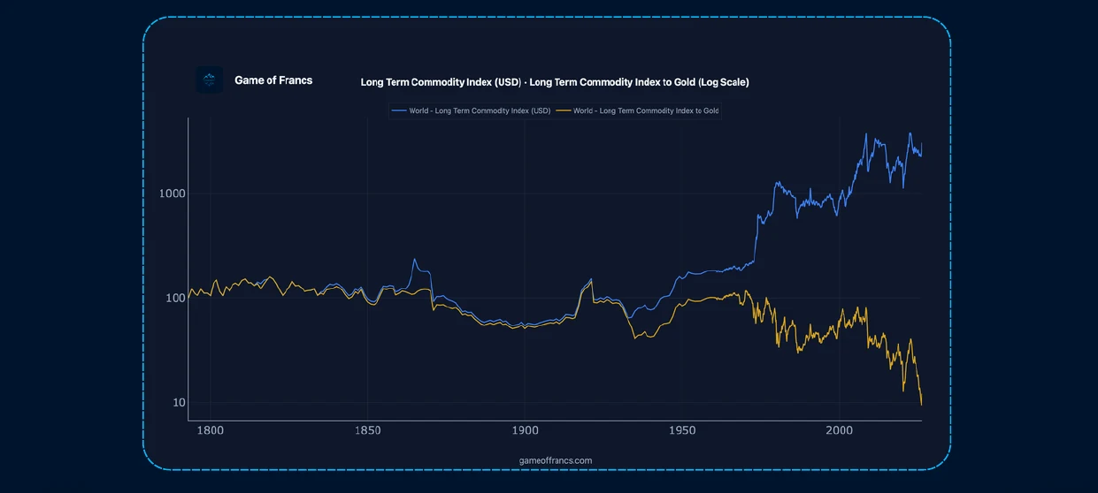
In dollars, the index drifts upward, slowly at first, then with increasing steepness as the 20th century progresses and the 21st century begins. The chart tells a story of relentless upward pressure — a world in which raw materials become progressively more expensive relative to the currency used to buy them. It is the chart that underlies almost every "inflation is permanent" narrative, every commodity supercycle thesis, every anxiety about resource scarcity.
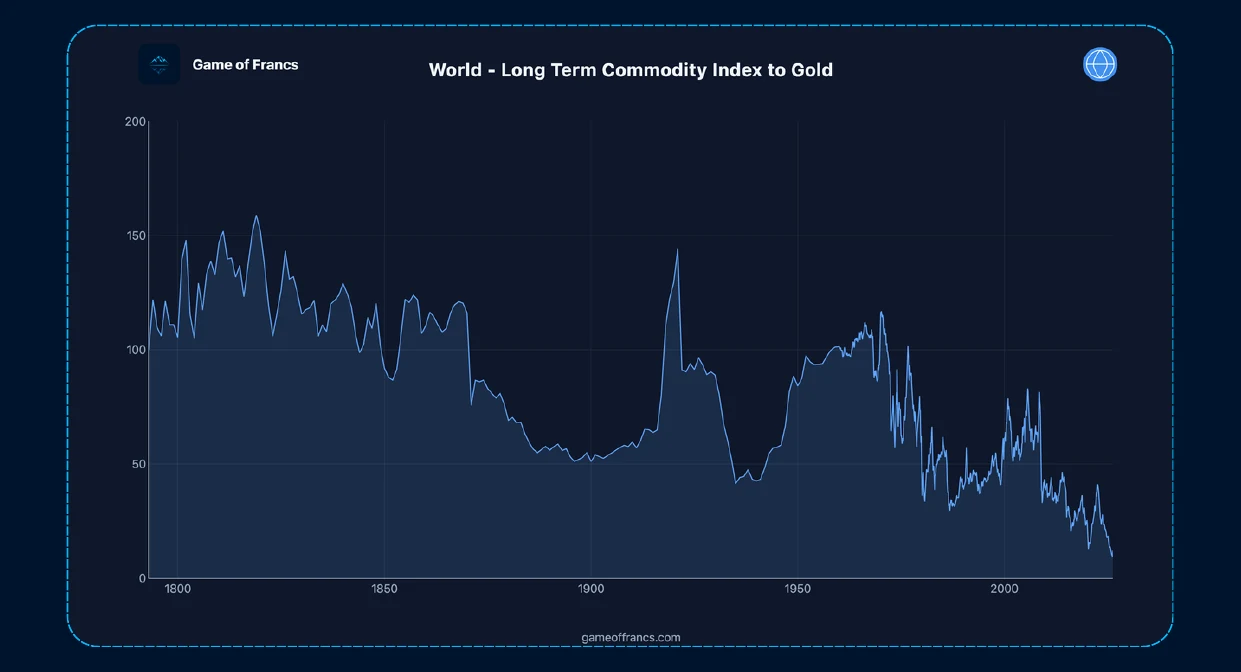
In gold, the same index does something structurally different. Over the very long run — across the 19th century, the early 20th century, and even significant portions of the modern era — it trends flat to downward, interrupted by sharp spikes that correspond to specific historical episodes of stress. There is no persistent upward drift. There is a cycle — sometimes violent, sometimes prolonged — around a slowly declining mean.
This is not a paradox. It is a description of what human civilization does to raw materials over time.
Every major commodity has been subjected to extraordinary productive force over the past two centuries. Agricultural yields have risen by multiples, driven first by mechanization and then by the nitrogen fertilizer revolution that effectively synthesized abundance from the atmosphere. Mining has become progressively more efficient, with technological advances allowing extraction from deposits that were economically inaccessible a generation earlier. Transportation costs have fallen by orders of magnitude since the age of sail and horse-drawn carts. Substitution has repeatedly turned one generation's scarce input into the next generation's obsolete technology.
The result — measured against a stable monetary anchor — is that commodities, broadly and over time, become cheaper. The dollar-denominated chart obscures this trend by mixing it with the opposing force of monetary debasement. Remove the monetary noise, and the underlying signal of human productivity becomes visible.
That is not a reason for complacency about commodity cycles. Those cycles are real, they are sometimes brutal, and they matter enormously for investment returns over multi-year periods. But it is a reason for skepticism about the permanent-supercycle thesis — the claim that raw materials are on a structurally irreversible upward trajectory. In gold terms, that thesis finds very limited historical support.
III. 1971: The Break That Explains Everything
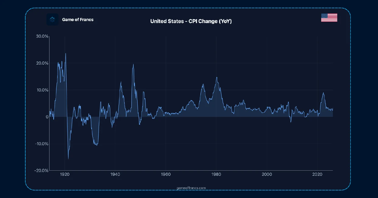
Every serious examination of long-run price data encounters the same inflection point: the early 1970s. In dollar terms, the commodity index does not merely accelerate at that point. It changes character. The gentle upward drift of the preceding century becomes something qualitatively different — more volatile, more intense, subject to swings of a magnitude that the pre-1970s data rarely produced. The break is visible, jarring, and requires explanation.
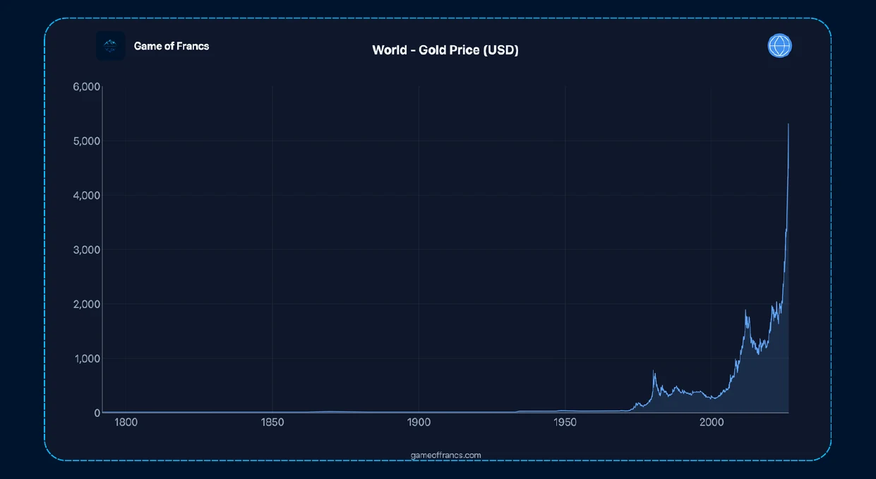
The explanation is August 15, 1971. On that date, the Nixon administration announced the suspension of dollar convertibility into gold, ending the Bretton Woods arrangement under which foreign central banks had held the right to exchange their dollar reserves for U.S. gold at a fixed rate of $35 per ounce. The decision was presented as temporary. It was permanent. And its consequences — still unfolding more than fifty years later — are etched into every long-run price chart in existence.
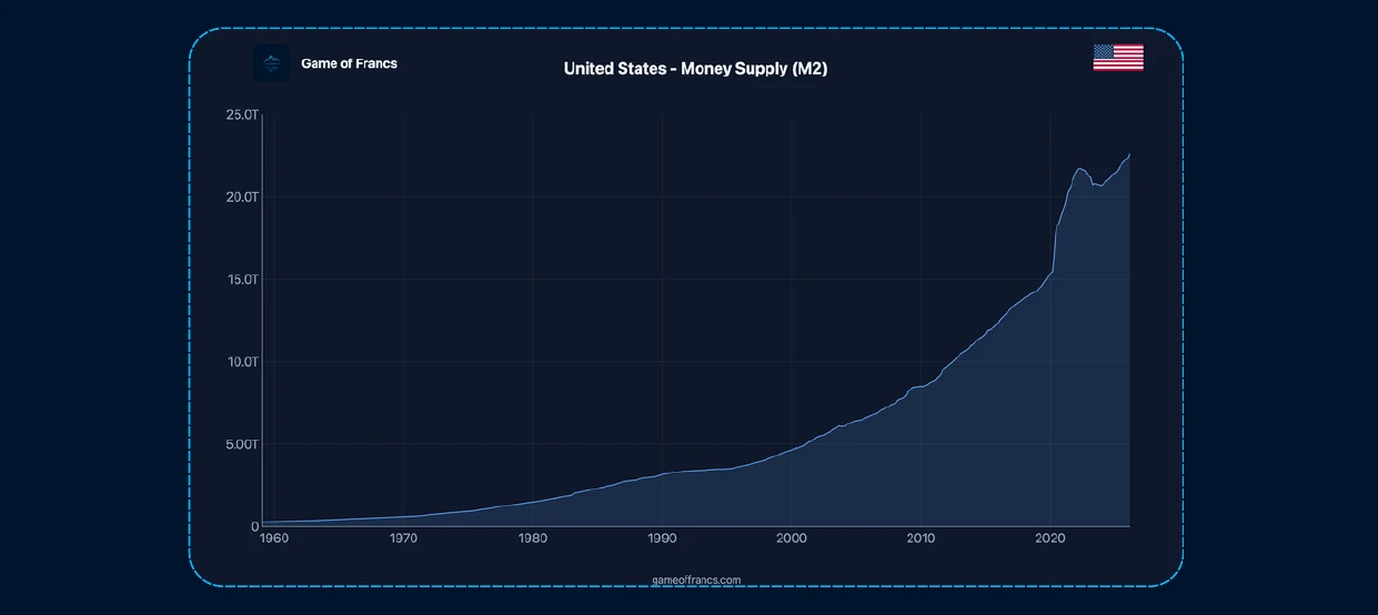
What happened in 1971 was not merely a policy change. It was a structural transformation of the global monetary system. Under Bretton Woods, the dollar's link to gold imposed a binding constraint on the expansion of dollar-denominated credit: ultimately, the United States could not create more dollar claims than it could back with gold at the agreed rate without triggering a run on its reserves. That constraint was uncomfortable, and periodically binding, and ultimately abandoned when the costs of the Vietnam War and the Great Society programs made the fiscal arithmetic impossible to square with convertibility.
After 1971, that constraint was gone. The supply of dollars — and, by extension, of dollar-denominated credit — became subject only to the institutional decisions of the Federal Reserve and the U.S. Treasury. In the decades that followed, global credit expanded from roughly $10 trillion to well over $300 trillion. The dollar lost the large majority of its purchasing power in gold terms.
IV. Reading the Regimes
One of the most analytically useful applications of the gold-priced commodity view is regime analysis — the examination of how different historical periods look when the monetary component is removed from the price signal. The results are consistently clarifying, and often surprising.
The inflation decade of the 1970s is the canonical example of commodity-driven inflation in popular economic history: oil shocks, OPEC, rising food prices, wage-price spirals. The dollar-denominated commodity index surges across the decade, and the narrative of commodity scarcity driving an inflationary spiral appears well-supported.
The gold-denominated view tells a different story. Across the 1970s, gold rose so powerfully — from $35 in 1971 to $850 at the 1980 peak — that the commodity index, expressed in gold terms, fell sharply. The commodities were not, in any fundamental physical sense, becoming scarcer relative to gold. They were becoming cheaper. What was rising was not the cost of the physical world. What was rising was the price at which the market was prepared to hold gold — a direct reflection of deteriorating confidence in the post-Bretton Woods dollar.
The 1970s were, in this reading, primarily a monetary crisis that expressed itself as a commodity crisis. The supply shocks were real, but they were amplified enormously by the collapse of the monetary anchor that had previously provided the price system with a reference point. The disinflation of the 1980s and 1990s looks equally instructive in reverse. In dollar terms, commodities appeared subdued throughout this period — the standard narrative of Volcker's tightening, restored credibility, and the deflationary impact of globalization. In gold terms, commodities actually strengthened across much of this period, reflecting the fact that gold lost relative ground as confidence in dollar-denominated institutions recovered. The signal and its mirror image are perfectly consistent.
The disinflation of the 1980s and 1990s looks equally instructive in reverse. In dollar terms, commodities appeared subdued throughout this period — the standard narrative of Volcker's tightening, restored credibility, and the deflationary impact of globalization. In gold terms, commodities actually strengthened across much of this period, reflecting the fact that gold lost relative ground as confidence in dollar-denominated institutions recovered. The signal and its mirror image are perfectly consistent.
The commodity boom of the early 2000s is conventionally attributed to the China factor — the industrialization of the world's most populous country, driving structural demand for steel, cement, copper, and energy at a pace the existing supply infrastructure could not immediately accommodate. That story is true as far as it goes. But in gold terms, the boom looks considerably less impressive than the dollar chart suggests. A meaningful portion of what was celebrated as a commodity supercycle was, again, a story about dollar weakness — the legacy of the post-dot-com monetary expansion and the early stages of a broader loss of confidence in fiat management that crystallized in the 2008 crisis.
The pattern is consistent across regimes: when money is being debased, the dollar commodity chart overstates the real scarcity story. When monetary credibility is being restored, it understates it. The gold lens does not eliminate the commodity cycle. It reveals it more clearly by removing the monetary distortion.
V. Beyond Commodities: Equities, Property, and Energy
he analytical value of pricing in gold extends well beyond a raw materials index. Apply it to the principal asset classes of modern wealth, and the picture that emerges is consistently more complex — and more honest — than the dollar-denominated version.
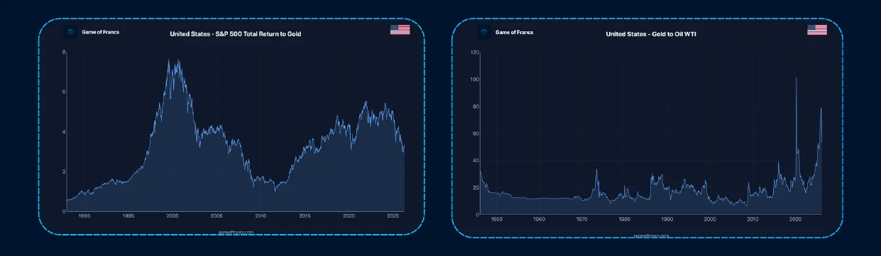
Equities have produced remarkable nominal returns over the past century, particularly in the United States. The S&P 500, measured in dollars, has compounded at rates that have made it the default destination for long-term savings across the developed world. Priced in gold, the picture is more nuanced: long periods of genuine real wealth creation — in which stocks genuinely outperform the monetary anchor — alternate with extended periods of mean reversion, in which nominal gains mask the erosion of real purchasing power. The Dow Jones Industrial Average, which peaked against gold at a ratio of roughly 45 in 1999, had fallen to below 6 by 2011. Nominal returns over that period looked respectable in dollar terms. In gold terms, they were severely negative.
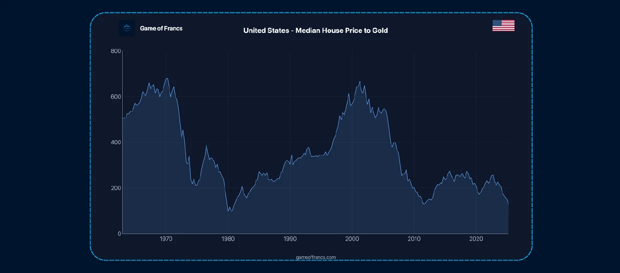
Real estate is perhaps the asset class most systematically distorted by monetary analysis. Property markets are part physical, part financial: they reflect genuine constraints on land, location, and construction — but they also reflect, very powerfully, the availability and cost of credit. A housing market inflated by a decade of suppressed interest rates and expanding mortgage credit can look like genuine scarcity in dollar terms. Priced in gold, the credit component becomes visible and separable from the genuine scarcity component. The distinction matters enormously for anyone trying to assess whether property is a store of value or a leveraged bet on continued monetary expansion.
Oil priced in gold deserves particular attention at the current moment. Historically, the gold-to-oil ratio has oscillated within a recognizable range that reflects the intersection of energy supply conditions and monetary credibility. When it dislocates dramatically from that range — as it did during COVID, and as it has done again recently in ways that are unusual by any eighty-year standard — it is registering something that goes beyond the normal commodity cycle. Either the monetary regime is shifting in ways that gold is beginning to price, or energy is undergoing a genuine structural repricing, or both. The current dislocation is significant enough to warrant serious analytical attention rather than dismissal.
VI. The Depreciation That Dare Not Speak Its Name
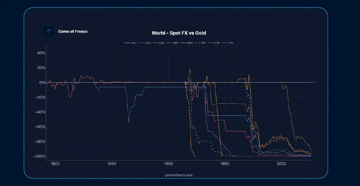
Across every asset class and every historical period, the gold-denominated view points toward a conclusion that mainstream financial commentary rarely states directly: the majority of major currencies have been in a long, slow, but ultimately dramatic depreciation against gold — interrupted periodically by episodes of restored confidence, but never reversing over the full arc of the post-1971 era.
This is not a fringe observation. It is visible in the data of every major central bank, every long-run price index, and the market prices of every monetary asset that cannot be printed. The question is not whether currencies depreciate against gold. They do. The only variable across different monetary systems and different time periods is the rate.
Some currencies depreciate quickly — through fiscal crisis, hyperinflation, or balance of payments collapse. Others depreciate slowly, almost imperceptibly in any given year, but with consequences that accumulate across decades and become undeniable across generations. The Swiss franc, the Japanese yen, and the euro have all depreciated against gold since 1971 — some more slowly than others, but none has maintained its purchasing power against the one monetary asset whose supply cannot be expanded by institutional decision.
The implications for how individuals, institutions, and policymakers think about the long-run preservation of value are direct. A portfolio entirely denominated in fiat currency is, over sufficiently long horizons, a portfolio with a structural headwind. The nominal returns it generates are partially real and partially a compensation for the deterioration of the unit in which they are expressed. Separating the two — distinguishing genuine wealth creation from monetary compensation — requires exactly the kind of dual-lens analysis that pricing in gold provides.
VII. A Tool for Thinking About Decades Long Cycles
It is not a prediction about the short-term direction of gold prices. Gold is volatile. It overshoots. It can decline sharply and for extended periods when monetary confidence recovers or when real interest rates rise sufficiently to compete with a non-yielding asset. Using the gold lens as a tactical trading framework is a different exercise from using it as a long-run analytical tool, and one that requires a different and more specific set of judgments.
What it is, is a method of intellectual hygiene — a way of enforcing the separation between two things that are systematically conflated in most financial analysis: changes in the world, and changes in the unit used to measure the world. That separation is not optional for anyone who wants to think clearly about value, cost, and the preservation of purchasing power across monetary regimes.
The ruler matters. It has always mattered. The evidence of two centuries of commodity data, equity returns, real estate cycles, and energy markets is consistent on this point: when the ruler changes, the story changes. Not always dramatically in any given year. But inexorably, across time. And for now, the data is unambiguous on one final point: measured against the one monetary instrument whose supply the financial system cannot control, the world's major currencies have moved in one direction across the past half-century. Every one of them. The only question — the one every long-term investor, saver, and policymaker eventually faces — is how quickly.
Get the next article by email
One email when a new piece is published. Nothing else, and one-click unsubscribe from any message.